After inserting the survfit{survival} object into
surv.plot{survSAKK}, we can create simple survival curves,
allowing to visualize survival patterns and incorporate various
statistics in our plot.
To show some benefit of this function, NCCTG Lung Cancer Data, available in the survival package is used.
Setup and Loading Data
# Load required libraries
library(survSAKK)
library(survival)

# Load lung data
lung <- survival::lung

# Compute survival time in months and years
lung$time.m <- lung$time/365.25*12
lung$time.y <- lung$time/365.25

# Create survival objects
fit.lung.d <- survfit(Surv(time, status) ~ 1, data = lung)
fit.lung.m <- survfit(Surv(time.m, status) ~ 1, data = lung)
fit.lung.arm.m <- survfit(Surv(time.m, status) ~ sex, data = lung)
fit.lung.arm.y <- survfit(Surv(time.y, status) ~ sex, data = lung)

Customisation of the survival plot
Colour, title and axis label
surv.plot(fit.lung.arm.m,
          # Colour
          col = c("cadetblue2", "cadetblue"),
          # Title
          main = "Kaplan-Meier plot",
          # Axis label
          xlab = "Time since treatment start (months)",
          ylab = "Overall survival (probability)"
)
Legend position, name and title
# Choose legend position and names of the arms
surv.plot(fit.lung.arm.m,
          legend.position = "bottomleft",
          legend.name = c("Male", "Female")
)
# Choose legend position manually and add a legend title
surv.plot(fit.lung.arm.m,
          legend.position = c(18, 0.9),
          legend.name = c("Male", "Female"),
          legend.title = "Sex"
)
Axis limits, xticks and yticks
surv.plot(fit.lung.arm.m,
          legend.name = c("Male", "Female"),
          xticks = seq(0, 36, by = 12),
          yticks = seq(0, 1, by = 0.2)
)
# Cut curve at 24 months
surv.plot(fit.lung.arm.m,
          legend.name = c("Male", "Female"),
          xticks = seq(0, 24, by = 6)
)
Font size
Global adjustment
surv.plot(fit.lung.arm.m,
          legend.name = c("Male", "Female"),
          # Global adjustment
          cex = 1.3,
          risktable.name.position = -6,
          risktable.title.position = -6
)
Specific adjustment
surv.plot(fit.lung.arm.m,
          main = "Kaplan-Meier plot",
          legend.name = c("Male", "Female"),
          legend.title = "Sex",
          # Size of x-axis label
          xlab.cex = 1.2,
          # Size of y-axis label
          ylab.cex = 1.2,
          # Size of axis elements
          axis.cex = 0.8,
          # Size of the censoirng marks
          censoring.cex = 1,
          # Size of the legend title
          legend.title.cex = 1.2,
          # Size of the risktable
          risktable.cex = 0.7,
          # Size of the risktable name
          risktable.name.cex = 0.9
)

Margin area customisation
# Change the margins and shift the y axis label
surv.plot(fit.lung.arm.m,
          legend.name = c("Male", "Female"),
          # New margin area
          margin.bottom = 6,
          margin.left = 7,
          margin.top = 1,
          margin.right = 2,
          # Define margin of the y-axis label
          ylab.pos = 4
)
Time unit and y-axis unit
The parameter time.unit can be set as follows:
"day", "week",
"month","year".
Note the following:
The time unit in
time.unitneeds to correspond to the time unit which was used to calculate the survival objectfit.If
time.unit = "month"x ticks are automatically chosen by intervals of 6 months. Whereas fortime.unit = "year"the x ticks are chosen by intervals of 1.
# Time unit of month
surv.plot(fit.lung.arm.m,
          time.unit = "month",
          y.unit = "probability",
          legend.name = c("Male", "Female")
)
# Time unit of year
surv.plot(fit.lung.arm.y,
          time.unit = "year",
          y.unit = "percent",
          legend.name = c("Male", "Female")
)
Drawing risk table
Per default the risk table is provided below the Kaplan-Meier plot. It provides information about the number of patients at risk at different time points.

Risktable position
# Move risk table names and titles to the left
surv.plot(fit.lung.arm.m,
          legend.name = c("male", "female"),
          risktable.name.position = -6,
          risktable.title.position = -6
)

Drawing segment
This section explains how to highlight a specific quantile or time point as a segment in the survival curve and how to adjust segment annotation.
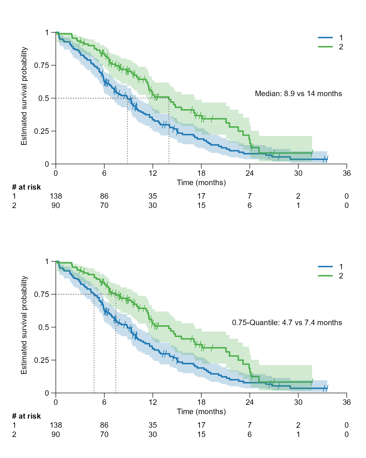
For a specific quantile
# Drawing a segment line for the median, which corresponds to 0.5 quantile
surv.plot(fit.lung.arm.m,
          legend.name = c("Male", "Female"),
          segment.quantile = 0.5
)
surv.plot(fit.lung.arm.m,
          legend.name = c("Male", "Female"),
          segment.quantile = 0.5,
          # Specifying time unit
          time.unit = "month"
)
# Drawing segment for the 0.75 quantile
surv.plot(fit.lung.arm.m,
          legend.name = c("Male", "Female"),
          segment.quantile = 0.75
)
Customisation of the segment
Change position of segment annotation
The parameter segment.annotation can take the following
values: c(x,y), "bottom",
"bottomleft", "left", "right",
"top", "none"
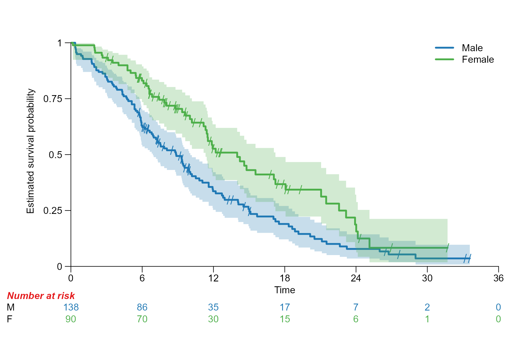
surv.plot(fit.lung.arm.m,
          legend.name = c("Male", "Female"),
          segment.timepoint = 18,
          segment.annotation = "top",
          time.unit = "month"
)
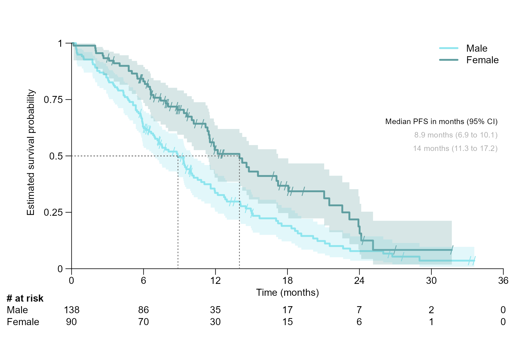
Segment title, font, size, and colour
surv.plot(fit.lung.arm.m,
          col = c("cadetblue2", "cadetblue"),
          legend.name = c("Male", "Female"),
          time.unit = "month",
          segment.quantile = 0.5,
          segment.font = 10,
          segment.main.font = 11,
          segment.main = "Median PFS in months (95% CI)",
          segment.cex = 0.8,
          segment.annotation.col = "darkgray"
)
Segment lines for different time points / quantile
Note that segment.annotation can only be chosen as
"right", "left", "bottom" or
"top".
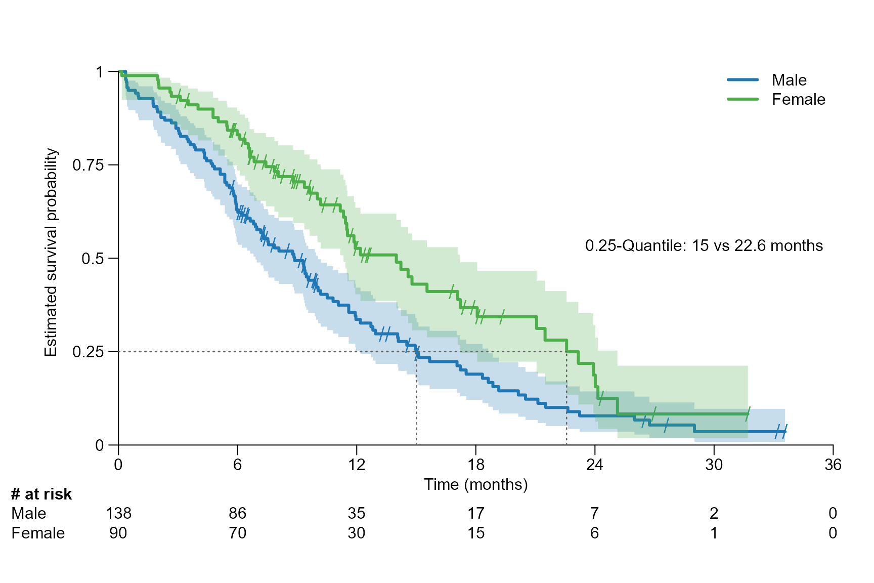
# Several quantiles: Drawing a segment line at the 0.25, 0.5 and 0.75 quantile
surv.plot(fit.lung.arm.m,
          time.unit = "month",
          segment.quantile = c(0.25, 0.5, 0.75),
          segment.annotation = "top",
          segment.annotation.col = "black",
          segment.annotation.offset = 1
)
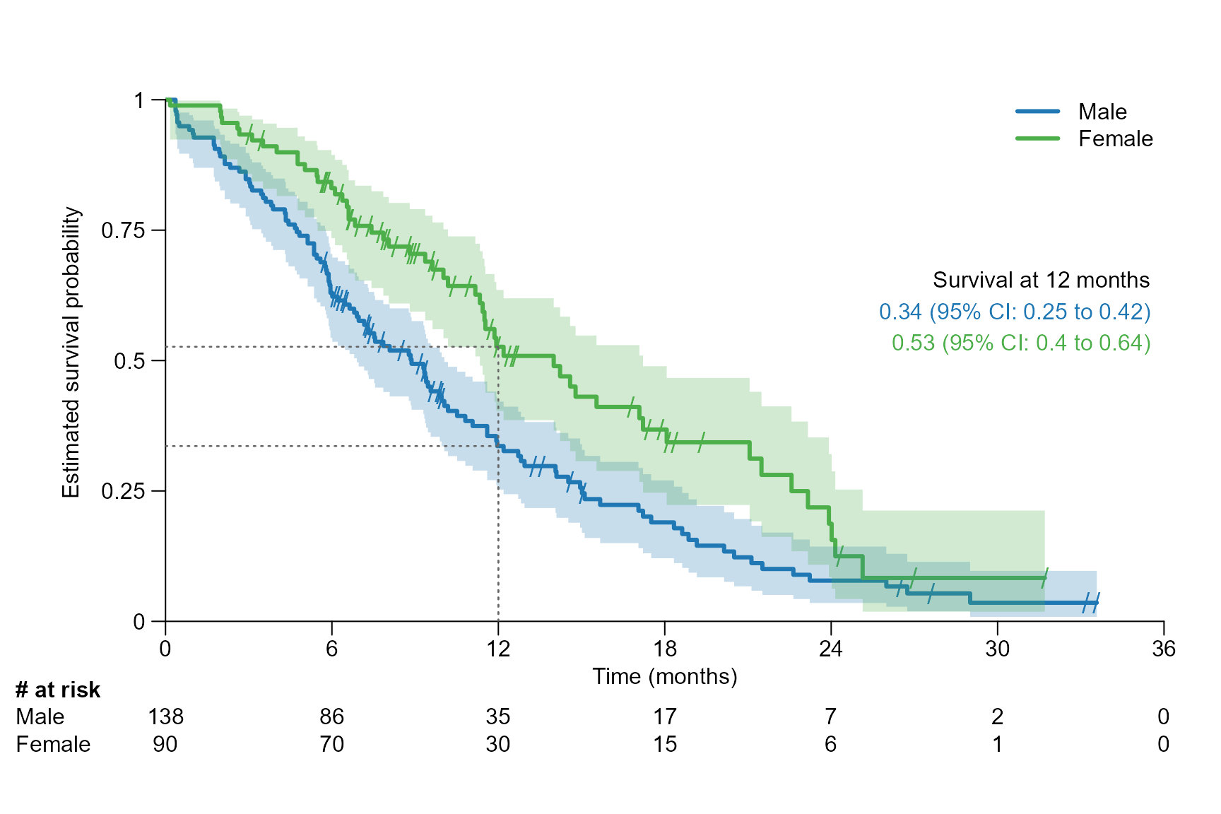
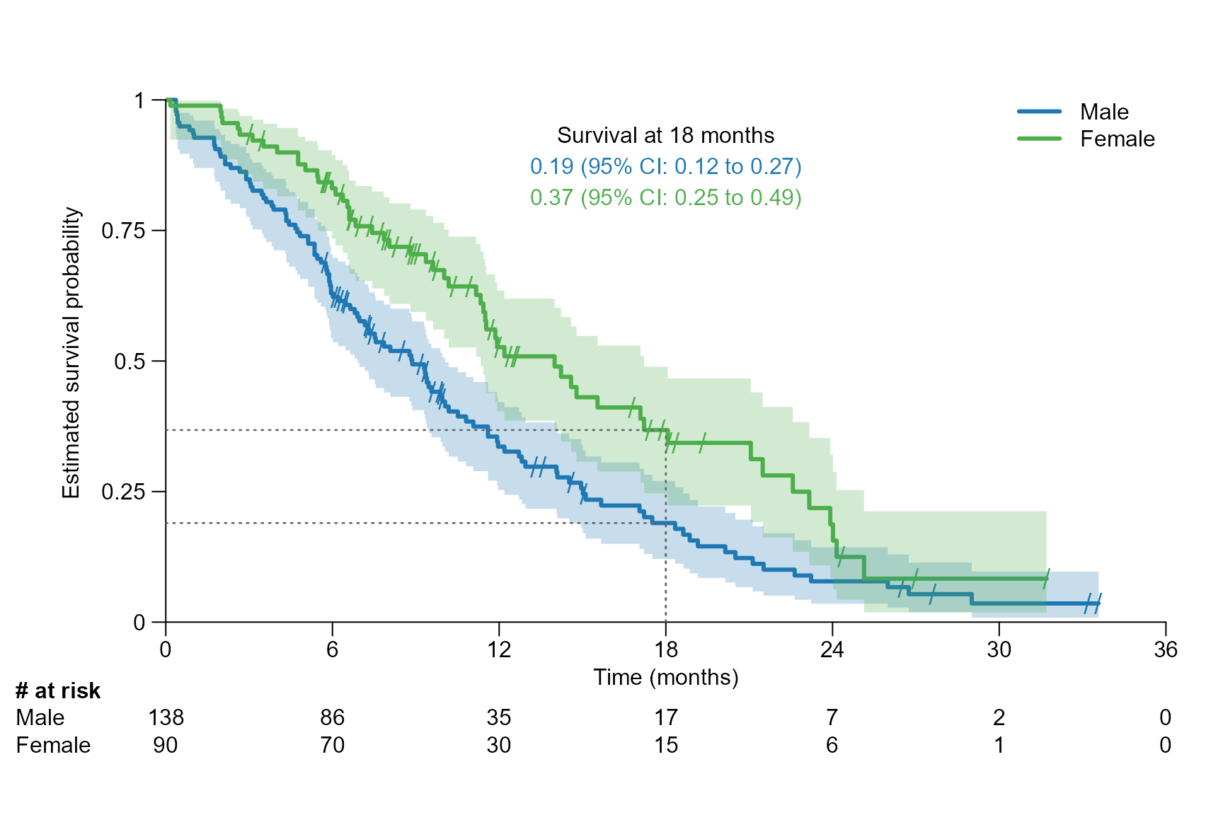
# Several time points: Drawing a segment line at 6, 12, 18 and 24 months
surv.plot(fit.lung.arm.m,
          legend.name = c("Male", "Female"),
          time.unit = "month",
          segment.timepoint = c(6, 12, 18, 24),
          segment.type = 1,
          segment.annotation.col = "black"
)
Segment line type, line width and text spacing
surv.plot(fit.lung.arm.m,
          legend.name = c("Male", "Female"),
          time.unit = "month",
          segment.quantile = 0.5,
          segment.lwd = 2,
          segment.lty = "dashed",
          segment.annotation.space = 0.1
)
Segment annotation short version
The confidence interval can be omitted in the segment annotation by
setting segment.confint = FALSE.
Examples for one arm:
surv.plot(fit.lung.m,
          time.unit = "month",
          segment.quantile = 0.5,
          segment.confint = FALSE
)
surv.plot(fit.lung.m,
          time.unit = "month",
          segment.timepoint = 18,
          segment.confint = FALSE,
          segment.annotation = "bottomleft"
)
Examples for two arms:
surv.plot(fit.lung.arm.m,
          legend.name = c("Male", "Female"),
          time.unit = "month",
          segment.quantile = 0.25,
          segment.confint = FALSE
)
surv.plot(fit.lung.arm.m,
          legend.name = c("Male", "Female"),
          time.unit = "month",
          segment.timepoint = 18,
          segment.confint = FALSE,
          segment.annotation = "bottomleft"
)
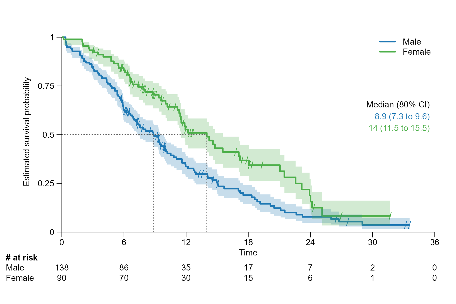
Modify confidence interval
surv.plot(fit.lung.arm.m,
          legend.name = c("Male", "Female"),
          segment.quantile = 0.5,
          conf.int = 0.8
)
surv.plot(fit.lung.arm.m,
          legend.name = c("Male", "Female"),
          time.unit = "month",
          segment.timepoint = 18,
          y.unit = "percent",
          conf.int = 0.9
)
Include statistics
There are three options for the parameter stat to
display statistics:
logrank: gives the p value of the log rank test calculated usingsurvdiff{survival}.coxph: gives the hazard ratio (HR) and its 95% CI of the conducted Cox proportional hazards regression usingcoxph{survival}.coxph_logrank: is a combination oflogrankandcoxph.


Customisation of the statistics
Stat position, colour, text size, and text font
surv.plot(fit.lung.arm.m,
          legend.name = c("Male", "Female"),
          stat = "logrank",
          stat.position = "right",
          stat.col = "darkgrey",
          stat.cex = 0.8,
          stat.font = 3
)
Stat with redfined reference arm and confidence level
surv.plot(fit.lung.arm.m,
          legend.name = c("Female","Male"),
          stat = "coxph_logrank",
          reference.arm = 2,
          stat.conf.int = 0.80
)
Stat with stratification
In the next example the ECOG performance status is used as stratification factor for the calculation of the statistics.
# Fit survival object with stratification

fit_lung_stratified <- survfit(Surv(time.m, status) ~ sex + strata(ph.ecog), data = lung)

surv.plot(fit.lung.arm.m,
          stat.fit = fit_lung_stratified,
          legend.name = c("Male", "Female"),
          stat = "coxph_logrank"
)
Predefined theme options
The following themes are implemented: SAKK,
Lancet, JCO, WCLC,
ESMO
surv.plot(fit.lung.arm.m,
          theme = "ESMO")
surv.plot(fit.lung.arm.m,
          theme = "Lancet")
Multiple plots using split.screen()
We use the parameter letter to add a letter for every
plot on the top to the right.
split.screen(c(2,2))
#> [1] 1 2 3 4
screen(1)
surv.plot(fit.lung.arm.m,
          time.unit = "month",
          segment.quantile = 0.5,
          segment.confint = FALSE,
          letter = "A")
screen(2)
surv.plot(fit.lung.arm.m,
          time.unit = "month",
          segment.confint = FALSE,
          stat = "logrank",
          letter = "B")
screen(3)
surv.plot(fit.lung.d,
          letter = "C")
screen(4)
surv.plot(fit.lung.m,
          time.unit = "month",
          col = "darkcyan",
          letter = "D")
close.screen(all = TRUE)